网页设计制作之改进超级链接效果(5)_XHTML教程
默认的超链接动作对应的颜色变化是:起初,超链接是蓝色的,并带有下划线;当点击时,它会变成红色;访问过的超链接将会以紫色显示。
The most readable way to render most text is black on a white background, and making text hyperlinks blue (#
最常用的增加超链接可读性的方法是:整体页面为黑字白底,文字超链接为蓝色(#
超链接的颜色可以有灰色替代蓝色,带不带有下划线均可。
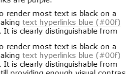
It's appropriate to ask if differentiating by colour alone will work for people who are colourblind. The image above is a screen capture of this page, totally desaturated. It shows that, even without colour, there is sufficient tonal difference between black and blue to make the hyperlink clear. The underlined version is a little bit clearer, but showing underline on hover would serve a similar purpose.
同时你还要考虑到假如仅仅依靠颜色的变化来区分超链接状态的话,那么色盲们可以接受吗?最好是询问一下他们是否能辨别这些颜色。上面的图片是页面截图,从上面的图片中你可以看到,即使不使用超链接的颜色变化效果,仅使用黑色和蓝色也能够很清楚的辨认出超链接。给超链接加上下划线将更有助于用户辨认超链接;或者是当鼠标经过超链接时出现下划线,这样也能达到同样的效果。
超链接是否需要带有下划线?

Underlining works okay for occasional inline links.
- 相关链接:
- 教程说明:
XHTML教程-网页设计制作之改进超级链接效果(5)
 。
。