网页设计制作之改进超级链接效果(7)_XHTML教程
一致性
It is important that hyperlink formats behave consistently across pages.
还有一点很重要,就是所有页面的超链接格式最好保持一致。
Obviously, where some text links are on different backgrounds, such as in navigation bars, they may need to use special colours or treatments.
很显然,当超链接位于不同的背景时,如:位于导航条内,那么我们将对其使用非凡的颜色和效果。
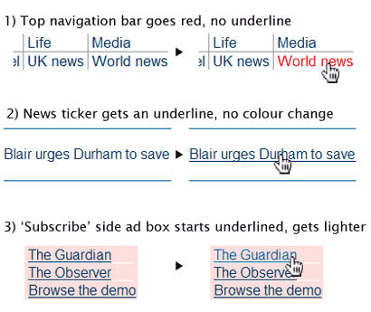
The above snippets are taken from the Guardian Online homepage
上面的片断来自于Guardian Online的首页。
While most links look similar (#036, mainly not underlined, there are several very different styles applied on the hover, when the mouse pointer moves over the active link.
上面的超链接格式看上去基本相同(字体颜色#036,超链接基本上不带下划线,当鼠标经过超链接时产生的效果各不相同)。
The psychological effect is disconcerting: you are left doubting whether all links will do similar things (i.e. go to another page on this site), or whether you might be taken unexpectedly somewhere else. I think that this schizophrenic behaviour weakens the brand experience, as well as diminishing usability.
从心里学角度讲,这样的效果处理会让人感到不安;同时,你会对此留有疑虑:是否所用的链接全是这样(包括其它页面);是否会链接到一个出乎意料的地方。我认为,这种让人感到精神分裂的效果处理方法将削弱用户对该网站品牌的映像,同时,网站的可用性也将大打折扣。
There is no good reason to treat all the hyperlinks differently. The third example also breaks the second principle, because its colour change makes it weaker, less noticeable, which is not 'highlighting'.
- 相关链接:
- 教程说明:
XHTML教程-网页设计制作之改进超级链接效果(7)
 。
。