字体设计基础----黑与白_字体设计教程
Black vs. white. Designing type is nothing more and nothing less than harmonizing black and white shapes. Black can't exist without white, and white can't exist without black. Black, the shape of a letter. White, the space in or in between letters. The amount of white inside a character defines the amount of white in between two characters.
黑与白
字体的设计,莫过于调整黑白空间的和谐。黑不能离开白而独立存在,白也是一样。黑,是字符的形体。白,是字符内部和字符之间的白色空间。字符内部白空间的大小,决定着两个字符之间白空间的大小。
As it is impossible to create a very black character with a big (white) counter form, a black typeface will always have smaller counters than a light typeface. Hence it follows that there is less space in between the characters (see drawing). A light typeface has much bigger counters. The space in between two letters has to be in proportion. As a consequence there is more white space in between light letters than in between black letters.
你永远不可能设计出一种笔画极其粗重而同时字怀(counter,字符内部包围的白空间)又很大的的粗黑体。一个粗黑体,其字怀永远要小于一个细线体,因而粗黑体的字符间距也一定要比细线体的小(如图)。细线体的字怀很大,其字符间距也必须相应的大,所以细线体的字符之间就需要比粗黑体更大的白空间。
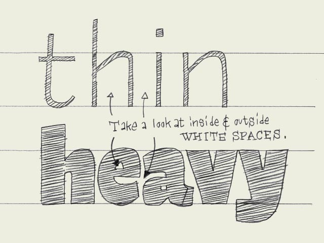
图片上的文字:
注意字符内部和外部的白空间
- 相关链接:
- 教程说明:
字体设计教程-字体设计基础----黑与白
 。
。